Short adventures in CSS art
CSS art is something I have always admired from a distance. With a skilled developer and a large amount of time, CSS alone can be incredibly powerful, and people have been able to create amazing works of art without any actual illustrations required. This weekend, I've decided to finally try my hand at it, and I'd like to quickly document my journey.
Starting out with tutorials
Naturally, my first step was to Google 'css art tutorial'. Google brought me to the Cassidy William's article Get started with CSS art. Looking at Cassidy's CodePen, it was clear to me that she was one of the aforementioned skilled developers. I delved into the tutorial, following it step-by-step, and before long, I had created my first CSS art: a smiling popsicle.

Because this was done following a step-by-step tutorial, there wasn't much creativity involved. It did, however, teach me the basics of how I should organize my structure, and how I can actually use CSS (and too many divs) to create art.
While doing research for this article, I also found Yosra Emad's How I Make CSS Art, which I would definitely recommend you check out if you're thinking of getting into CSS art yourself. Yosra goes into a lot of practical details about structure, positioning, responsivity, etc.
Having created my first artwork, it was time to move on to something more original.
Simple illustration
If I read Yosra's article before I started making my first original artwork, I would have known to sketch my idea first. That didn't happen, so I boldly started creating a pride flag illustration without really having a solid idea of what I wanted. In retrospect, I believe that cost me about an hour of my time.
My first illustration eventually ended up being a bisexual pride flag, suspended on a pole, full with a flutter and wind animations (sidenote: the wind animation isn't visible on the GIF below). I was trying to push myself to find what I (and CSS) was capable of.
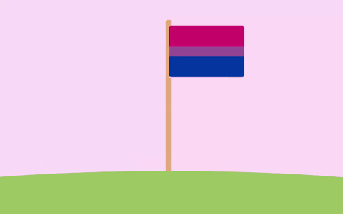
The art itself is fairly simple, with two interesting things I will mention; the first one being the ground -- I wanted the ground to have a visible curve, which proved to be a small struggle. Eventually, I ended up creating a huge ball (a div with a 50% border-radius) around 2 screens wide and 30 screens high. This way, I could have only the top part of the ball visible, simulating the curve of a very small planet. The second thing to note is that, because I wanted my artwork to fit on a single screen, I disabled scrolling. I achieved that using this code snippet:
body {
	margin: 0;
	height: 100%;
	overflow: hidden;
}
This prevents the potential viewer scrolling away from the area of focus.
The animations were a bit more interesting. I tried my best to find a CSS-only flag flutter animation, but none that I could find suited my cartoon-y style, usually attempting to re-create a realistic flutter instead. Because of this, I neded up using a very simple animation which bobs the flag up and down while simultaneously rotating it on the Y axis by about 20 degrees. I believe that this creates a fairly readable "flag in the wind" animation.
The other animation I had to create was the wind. Once every while, in seemingly random spots, a gust of wind flows by in the background. To achieve this effect without any JavaScript, I've come up with an incredibly hacky solution. I am 100% sure there are better ways to do this, and if you know of one, please let me know, I will be glad to learn.
My solution consists of a "wind gust" div, which essentially contains three white lines, and a 12-second-long keyframe animation. In the duration of this animation, 4 gusts of wind fly by. I've pre-generated some random starting heights in order to simulate randomness, and, after each gust passes from the left side of the screen to the right, I teleport it back to the left and, with a delay, reset it. My keyframe animation then looks something like this:
@keyframes wind {
	0% {
		top: 25vh;
		left: -110vh;
	}
	10% {
		top: 25vh;
		left: 110vh;
	}
	20% {
		top: 25vh;
		left: 110vh;
	}

	20.001% {
		top: -19vh;
		left: -110vh;
	}
	30% {
		top: -19vh;
		left: -110vh;
	}
	40% {
		top: -19vh;
		left: 110vh;
	}
	50% {
		top: -19vh;
		left: 110vh;
	}
	50.001% {
		top: -28vh;
		left: -110vh;
	}
	...
}
I know, I'm not proud of it either.
With that being said, that was my first actual original artwork made entirely in CSS. After this small project, I moved on to something more classy and presentable -- and I tried making it somewhat interactive as well.
Interactive art
I didn't want to leave the thematic of pride art yet, so I've decided to pull up my GitHub repo for one of my older projects, the Figma Pride Flags & Gradients plugin, and reuse some of the CSS I wrote for that. I ended up creating 'tiny pride flags', a small project I am actually quite proud of. You can check it out here. If you don't want to play with it yourself, here's a short GIF of it.
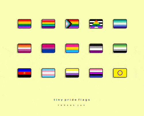
Each of the pride flags is created by cleverly combining CSS gradients. I already had some of them from my aforementioned project, but a lot of them I had to find online and/or write myself. Highlights include the ally flag, for which I had to work with the clip-path attribute, the polyamory flag, which includes the pi symbol in Times New Roman, and the Gilbert Baker pride flag, because it threw me into a 30-minute reading rabbit hole about the history of the rainbow flag (which I've gone through before and have since forgotten).
Other than the flags themselves, the CSS in this project is fairly basic; perhaps the only thing worth mentioning are the hover animations. Whenever a user hovers on a flag, three things happen. The flag gets raised a bit -- this is achieved with a simple transform: translate() statement -- the box shadow reflects this movement -- specifically, using this process:
box-shadow: -4px 2px rgba(0, 0, 0, 0.2);
 =>
box-shadow: -5px 3px rgba(0, 0, 0, 0.05);
and finally, a little tooltip with the flag's name appears. The implementation for these tooltips was taken from a W3Schools guide.
I spent a few hours working on tiny pride flags, and I can proudly say I find the result incredibly cute and that I'm displaying it on my GitHub profile. As I said, however, this project didn't have much in the way of actual art complexity. It was time to delve into my largest and most ambitious CSS artwork yet.
A complex artwork
My penultimate piece of CSS art was by far my most ambitious one. It was an illustration of the 8 planets of the solar system (sorry, Pluto), which took me about 5 hours to make. Each planet is its own div, with most of them featuring other elements to add detail. The first 4 planets are arguably to scale, with the latter 4 being scaled down by a factor of 4 to fit on the screen. The spaces between them are, naturally, wildly not to scale. This artwork was a lot of fun, trial and error, and creative solutions. You can find the full code here on my GitHub, but here are the highlights.
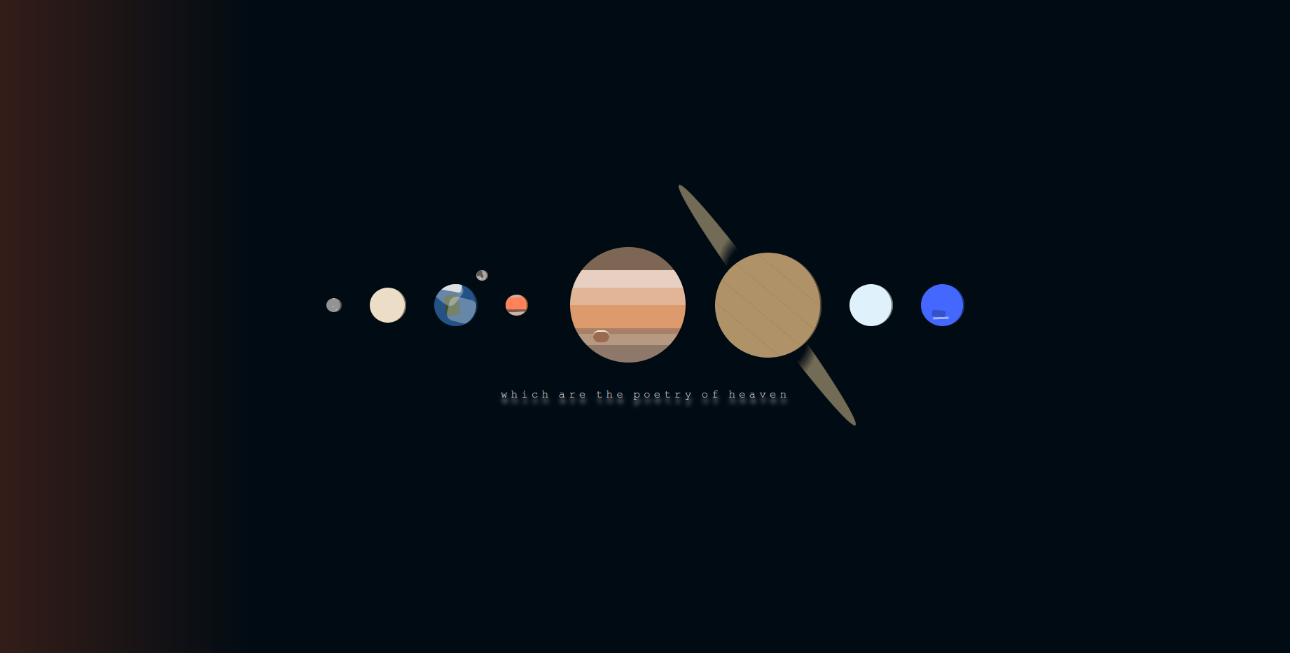
Mercury, Mars, and Neptune feature small details that correspond to geographical features found on my reference photos. Mercury has three small craters, Mars features several differently-colored bands (I color picked the hexcodes from an actual photo of Mars), and Neptune boasts its signature Great Dark Spot.
Saturn, of course, has its ring. In my implementation, the ring is essentially a circle with its center cut out (using a radial-gradient), rotated in 3D space (aptly using the rotate3d() CSS function), and positioned to fit the planet itself. This took a lot of trial and error to get right.
Jupiter is made out of 7 bands of color, each of which I, again, color picked from a photo of the gas giant. There is also the essential red spot, which is just a capsule-shaped div with a top border.
Earth and her Moon feature several rounded rectangles of various colors and opacities that combine together to create the vague shapes of the Arctic, North America, some clouds, and the lunar maria. There is also the Tycho crater, represented by a small light dot.
Besides the planets themselves, there is a subtle light coming from the left, symbolizing the Sun. This effect is achieved with a linear gradient over the entire screen, which starts as a bright orange color, but quickly fades into the background rich black.
The quote below the planets, also being the title of the artwork, is attributed to Lord Byron.
I very much enjoyed working on this piece of art. It took a lot of learning and trial and error to get everything right. Surprisingly, getting 'bugs' in my art was a fairly fun experience. At one point, I had to deal with Earth's Moon attaching itself to Mars, or the Sun deciding to only shine in perfectly horizontal solid rays. Bugfixing these silly errors was a welcome mistake to actual bugfixing while working on important, practical code.
After this long and tiring endeavor, I've decided to end my CSS art journey with something more mindlessly relaxing.
Pixel art
I wanted to try making pixel art in CSS, partly because I expected it to be severely more restrictive (and thus less creatively exhausting) than other styles of art. To further lessen the strain on my creativity, I chose to recreate an existing artwork -- one of the sprites used in the amazing platformer game created by Maddy Thorson, Celeste. The artwork features the main character, Madeline, being gripped by a tentacle, about to be pulled down towards her probable death. The tentacle symbolizes Madeline's anxiety and depression.
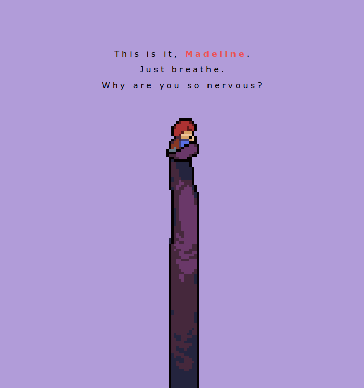
The way I went about creating CSS pixel art was basically to create a huge, 13x110 table, with each cell acting as one pixel. I then opened the original sprite in a pixel art editor to be able to clearly look at the art, and I recreated the sprite row by row. Each pixel is, then, an empty div with a class that sets its color. Overall, filling in the 1430 pixels took me about 2 hours of relaxing work. Honestly, while there was little creative about this part of the project, I might do something similar semi-regularly; it was somewhat reminiscent of filling in adult coloring books.
There is not much more to say about this artwork. I am sure that creating original pixel art in CSS is not only possible, but also significantly more fun and creatively rewarding than recreating an existing artwork. However, because I am not a skilled pixel artist, I figure that if I ever want to come back to it and learn it properly, I should do so using something other than CSS and HTML tables. For my last artwork, though, this proved a fun, mindless project.
With my journey properly documented, there is but one question left.
... why?
tl;dr: because it's fun.
As far as I know, there is no practical reason to be doing this. Making vector art in a software like Adobe Illustrator or Inkscape is almost definitely faster, easier, and outputs better results. It, however, loses a lot of the programming jankiness that CSS art offers. Personally, I can find a sort of magic in my entire illustration falling apart because of a wrong setting in a flexbox. These sort of errors mean that CSS art brings bugfixing into an incredibly relaxing and creative endeavor; and somehow, it works.
Besides fun, there is also an argument that making art in CSS helps you break down illustrations into simple shapes and colors (which is a valuable skill for an artist), and it helps you learn fine control over CSS. While this is certainly at least partly true, I would counter-argue that there are many more effective ways of learning these skills. CSS art is also incredibly light-weight -- the pride flag example from above is, all-in-all, about 6KBs. There is some actual merit to that, but, with modern computing power, only if you're dealing with artworks on a massive scale.
Mostly because it's fun, though.
Thanks for reading this article by Tadeas Jun! Have any thoughts, feedback, or just want to chat? Contact the author at contact@tadeasjun.com, or on Discord at @tadeasjun. Tip them on their PayPal or hire them as a world designer, writer, or software engineer via their Portfolio page.